Logan City sought to revitalize its older city logo and enhance its tourist appeal. Tasked with this challenge, I undertook Modernizing their logo. The new logo served as the foundation for a series of engaging tourist stickers, each showcasing a unique theme that captured the essence of Logan City.
Refreshing Ideas
The existing Logan City logo offered a foundation for capturing the beauty of Cache Valley, but it lacked the warmth and approachability desired for a tourist-focused approach. To achieve this, I aimed to infuse the logo with a hand-drawn, rustic aesthetic that would differentiate the new design from its predecessor, creating a more inviting, comforting, and memorable image for visitors.
Following the logo redesign, the client requested a series of stickers incorporating the new Logo. This included variations of the logo in a warmer color palette and additional designs that aligned with the city's tourist-oriented focus.
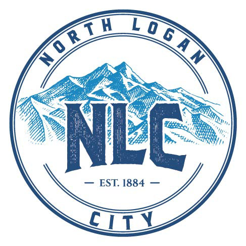
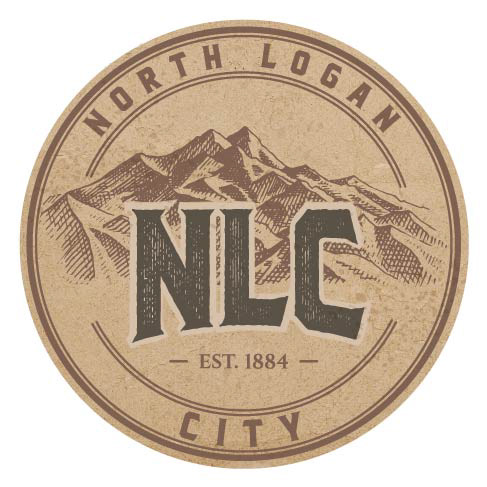
The Client Loved the overall approach and appeal to their goal of a more tourist and visitor-focused Logo and product.
